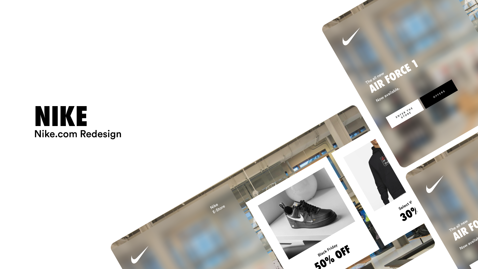
Redesigning Nike.com
This is completely and only a design project. This does not contain any UX work or research.
Nike's Brand Strategy
Nike’s power and influence in it’s branding comes from active, innovative and impactful design. It’s always been dedicated to providing powerful, futuristic fashion, especially in sports. The belief that everyone can be an athlete, and working to make that a reality makes it stand out from the other sport brands.
Active
Fast. Powerful. Swift. Energetic.
Innovative
New. Futuristic. Shiny. Out of the box.
Powerful
Bold. Strong. Forces Change.
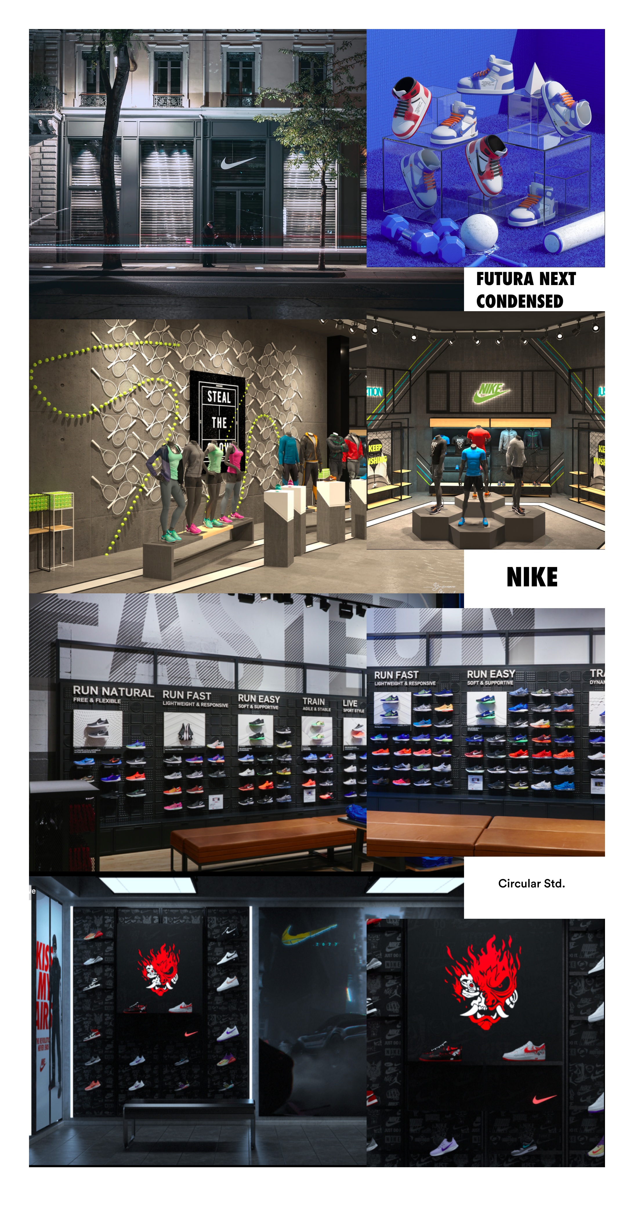
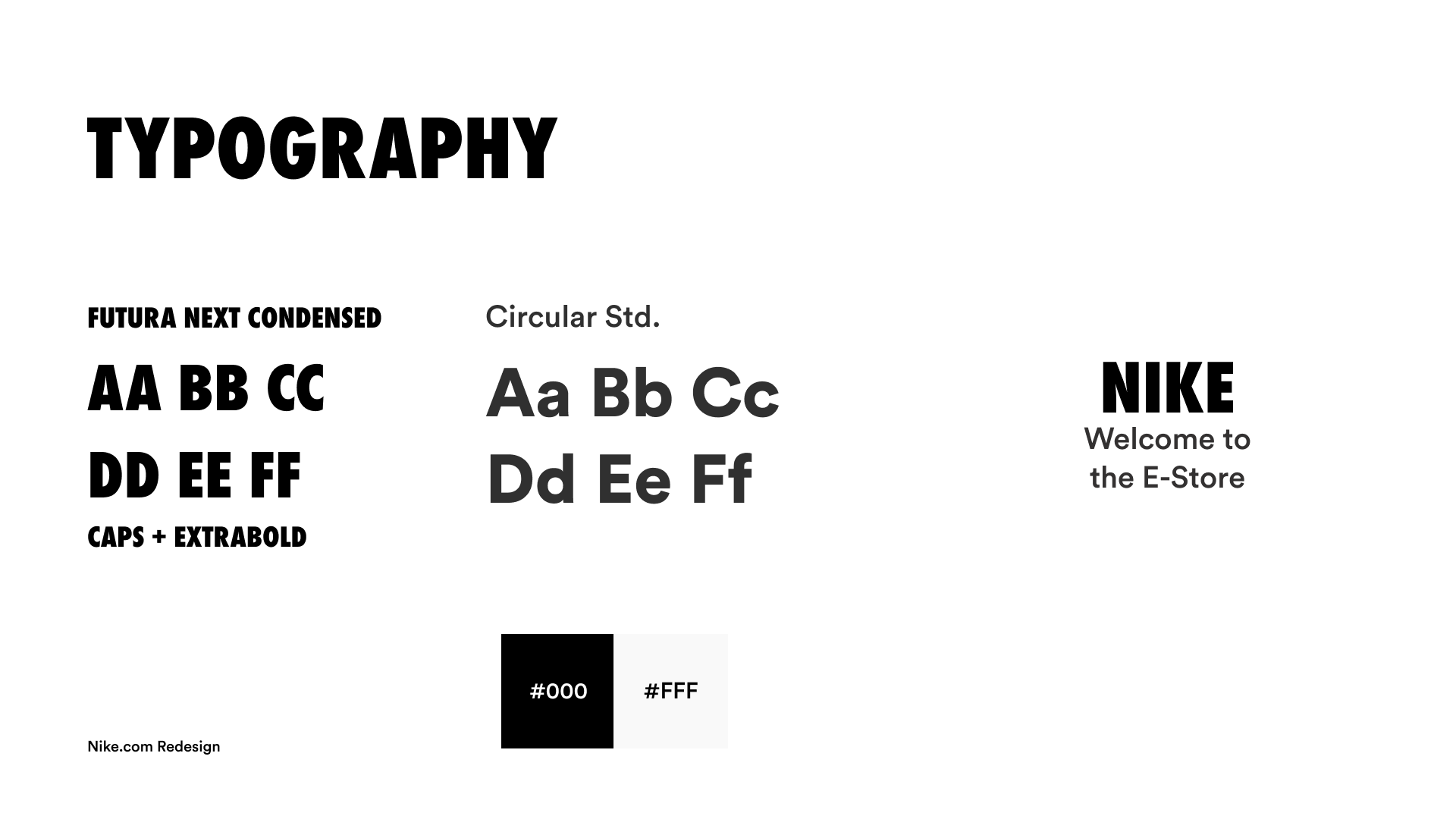
Typography and Colors
The Selected type was Futura Next Condensed, keeping in line with Nike's Current Style, and switched out the Text Font to Circular Std., a good clean font, with excellent legibility.
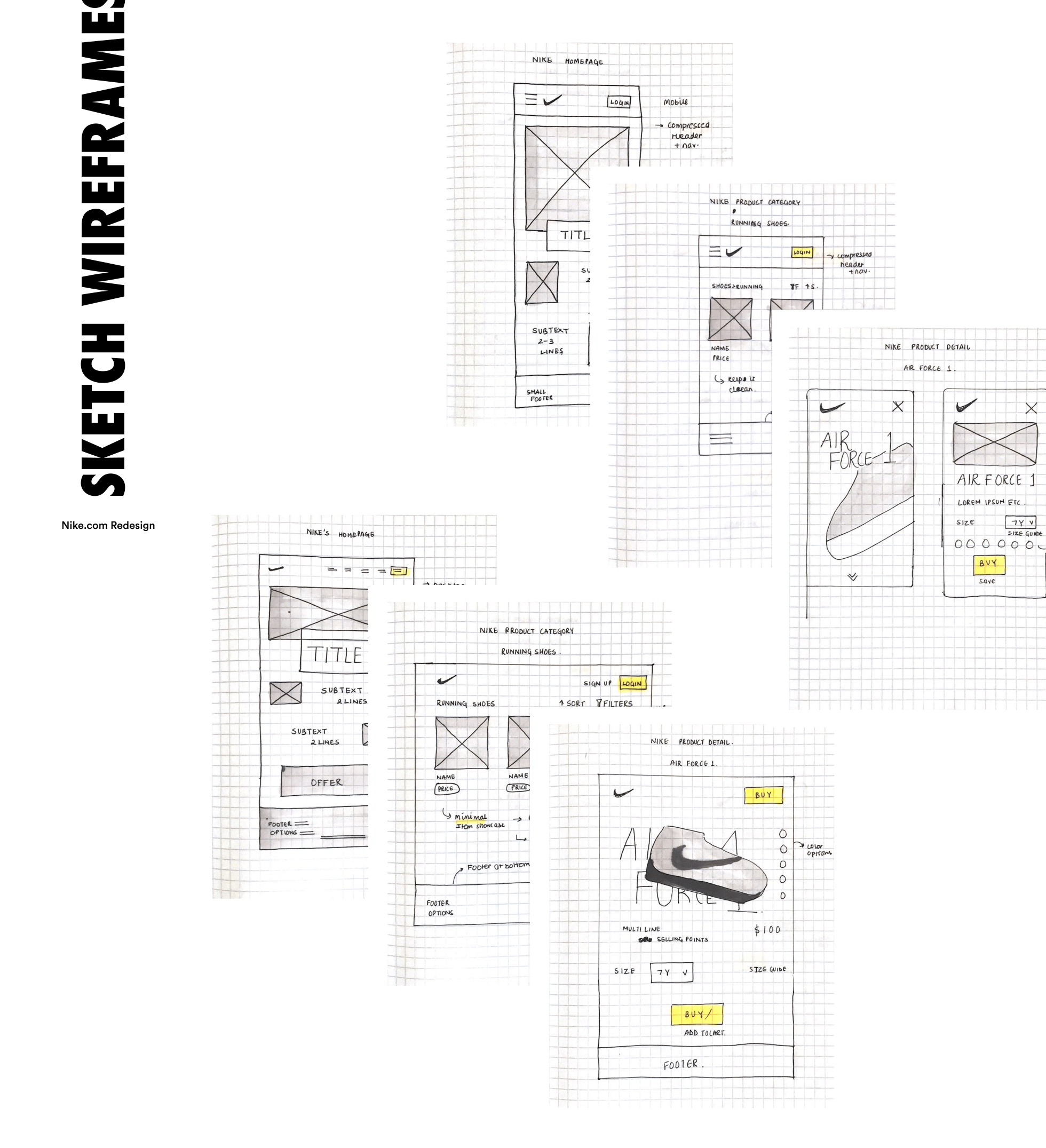
Sketches
Fleshed out a ton of sketches and wireframes with the traditional ecommerce website design, product catergories and layout.
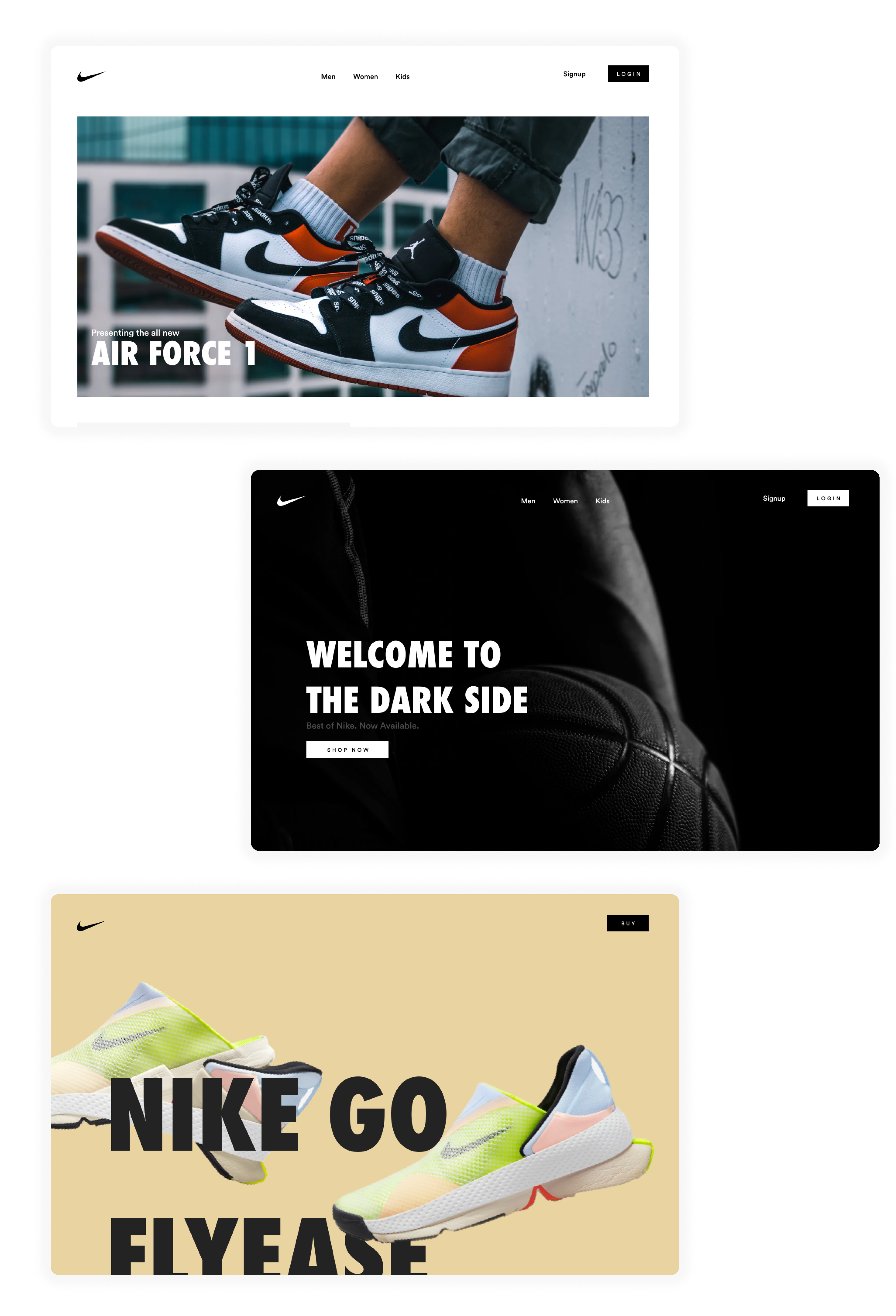
UI Iterations
I created these sketches into High Fidelity UI, but I was however disappointed with how generic it looked. It was missing the Nike Touch.
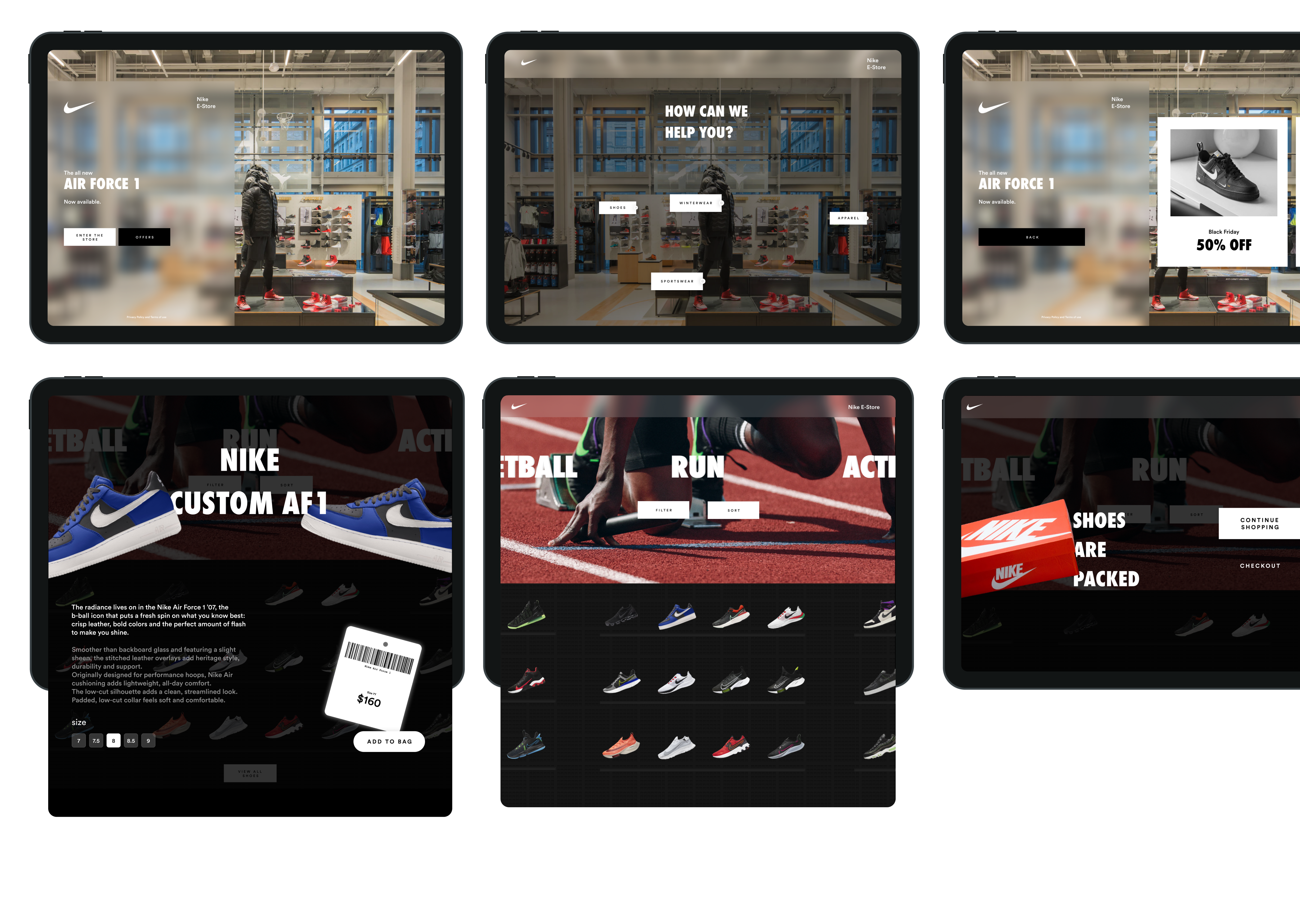
Final Final.fig
With some ultimate 4AM inspiration and lots of caffiene, I ultimately settled for a full virtual store experience. The idea was to let people walkthrough the whole store virtually (especially in these trying times) and still have the look and feel of a high end nike store.