Out of this world
What's it about
Component LibraryUI Design.
This is completely and only an interaction design project. This does not contain any UX work or research.
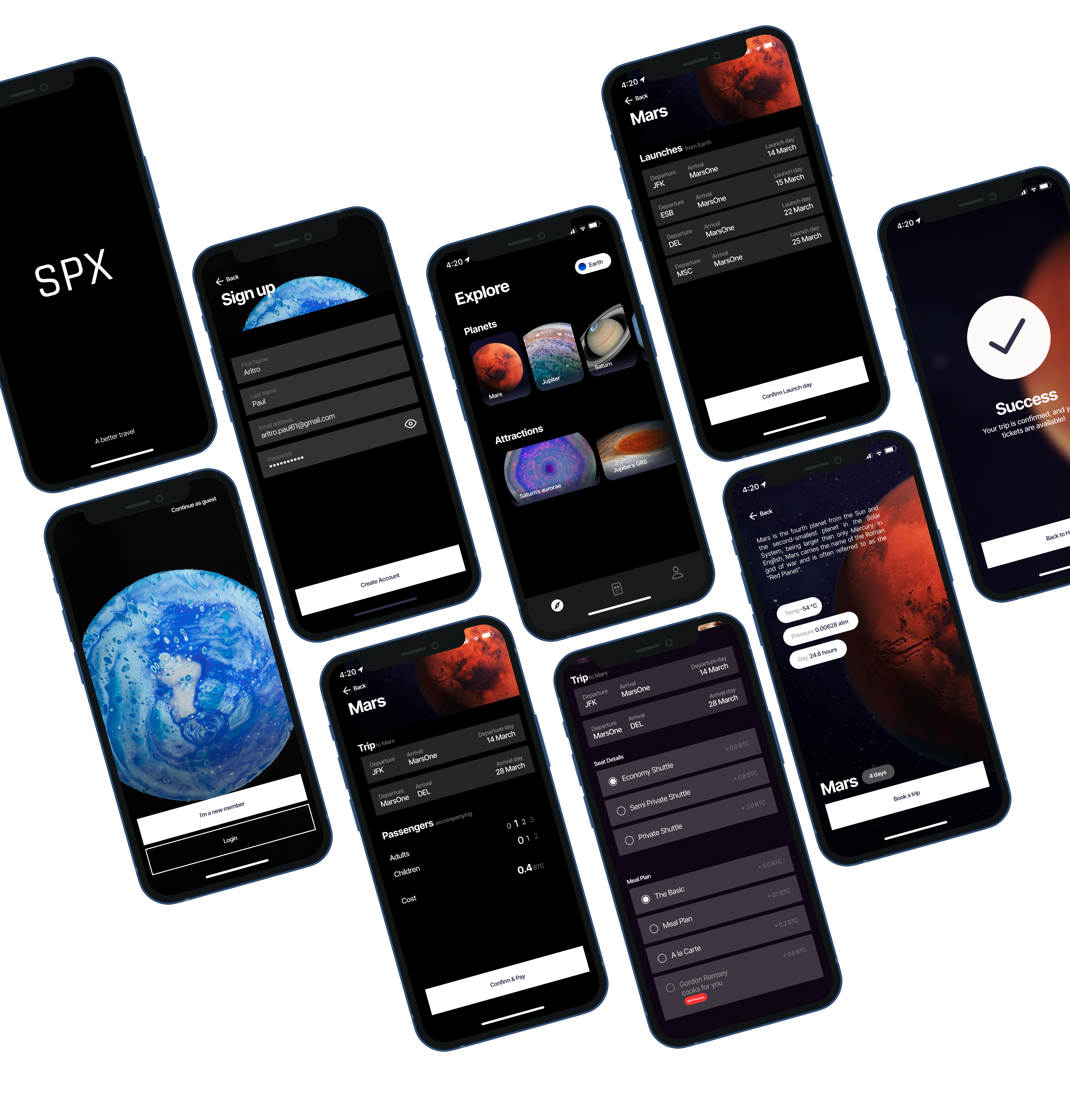
SPX
SPX was part of a larger project, but the goal of this was to learn and understand the working of components and libraries. The First Part was to build a custom component library for a Space Travel Application.
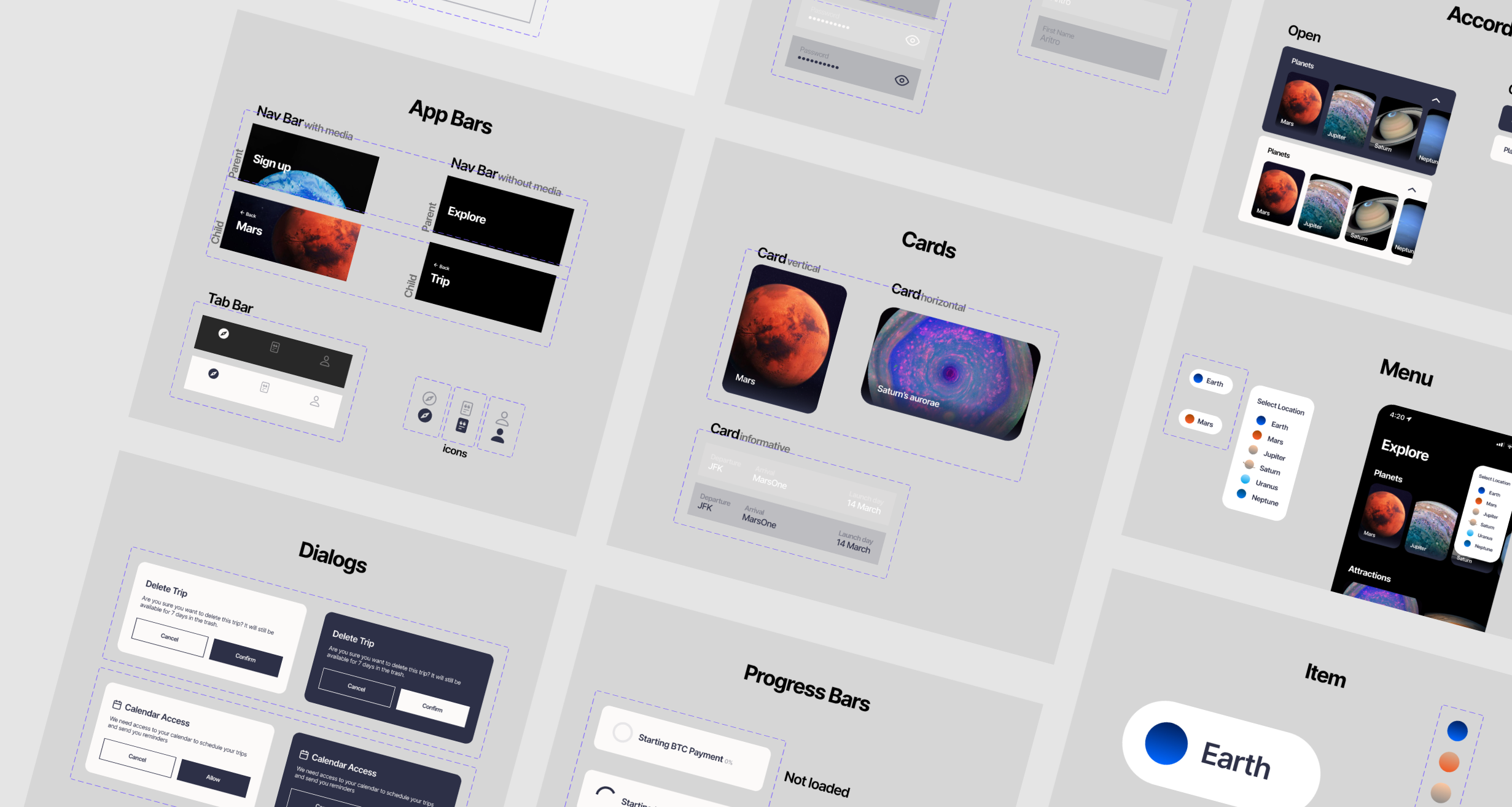
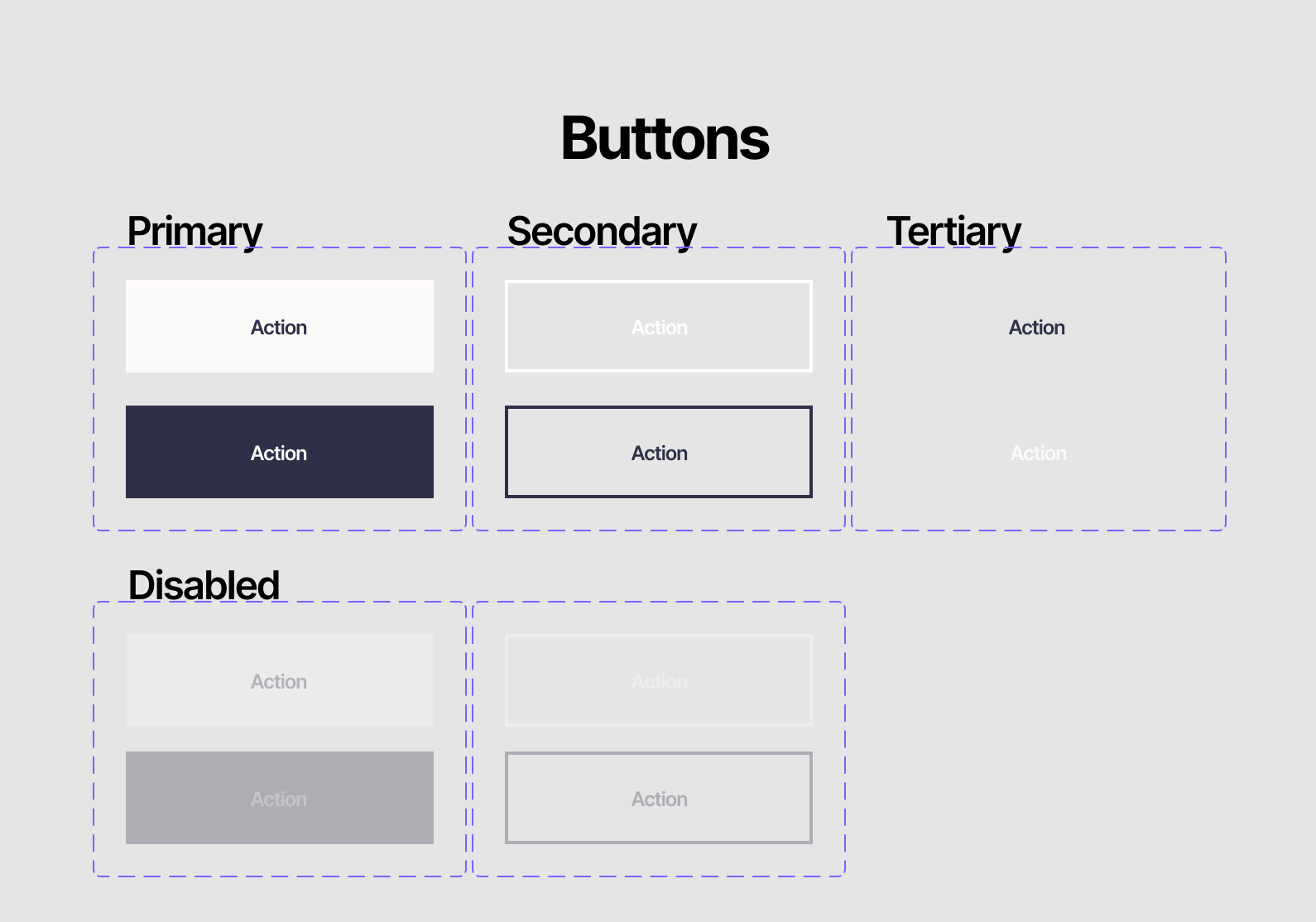
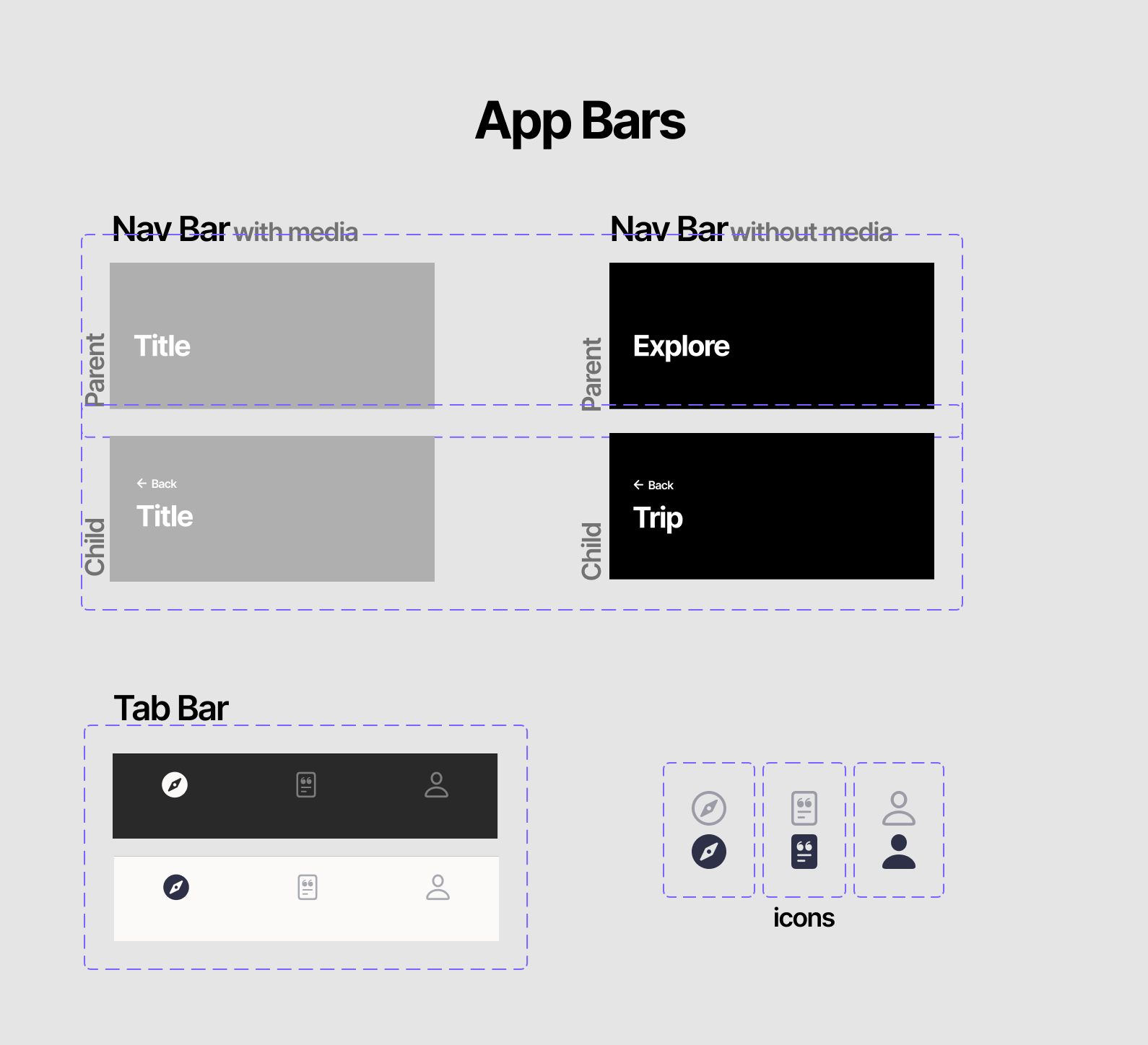
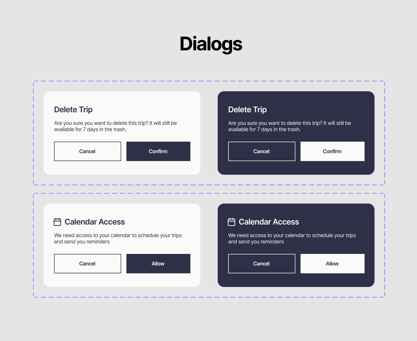
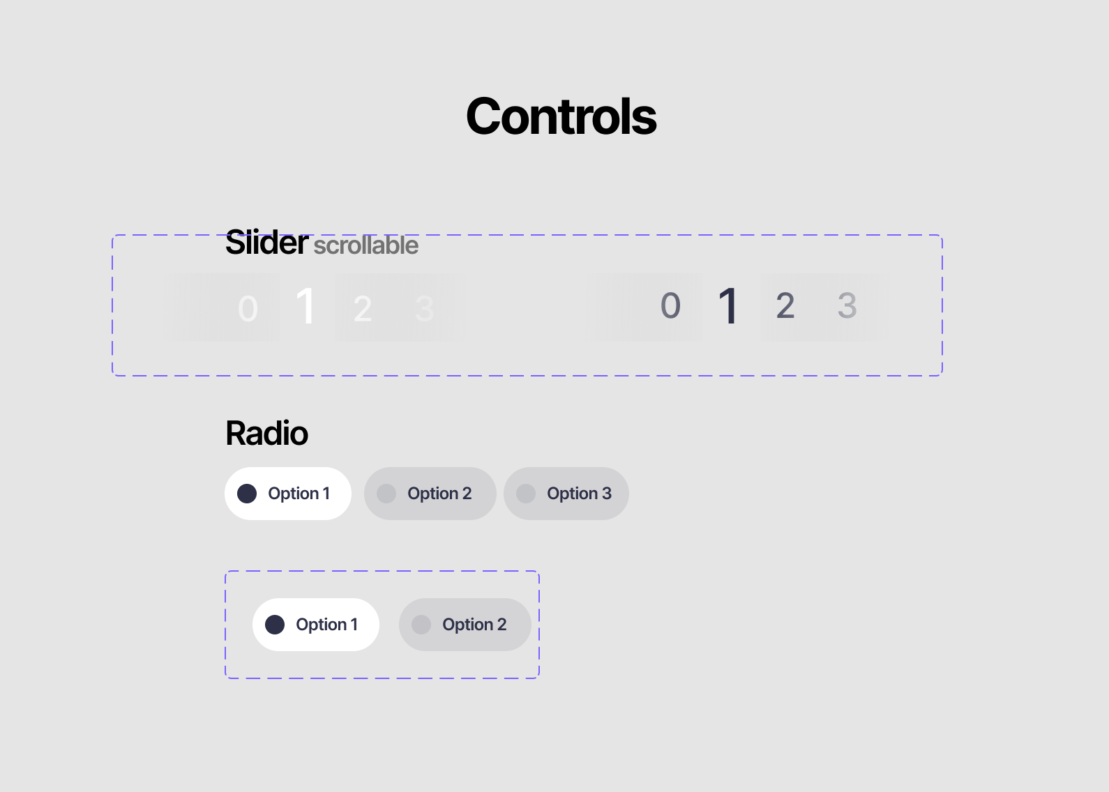
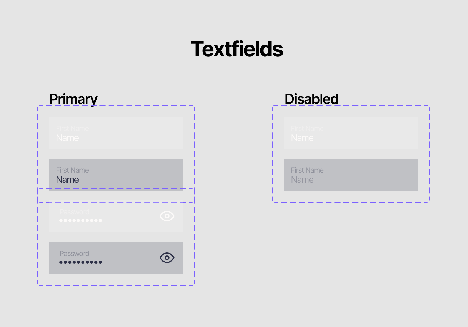
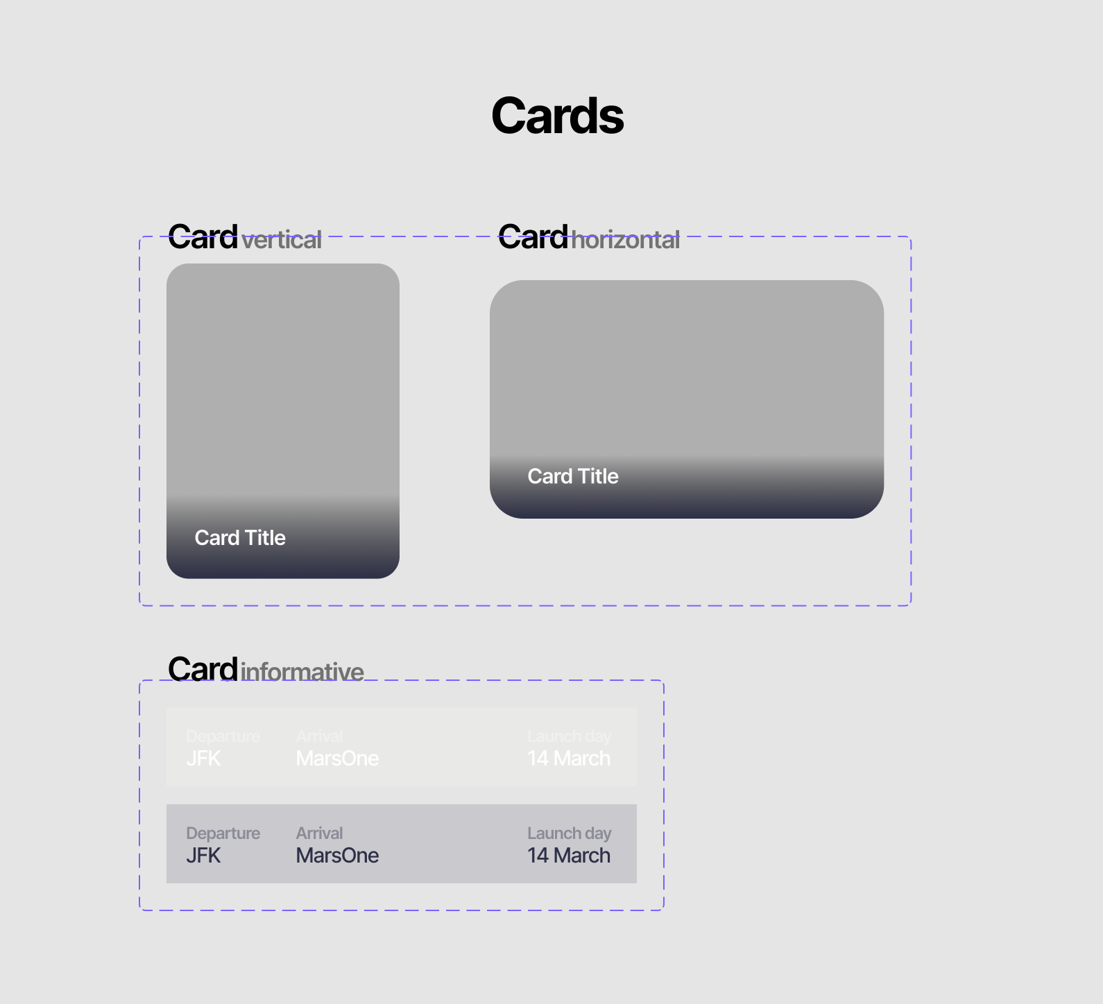
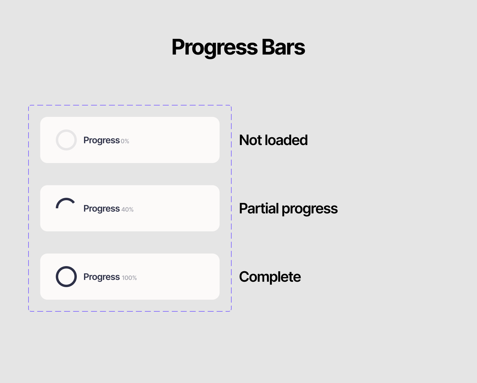
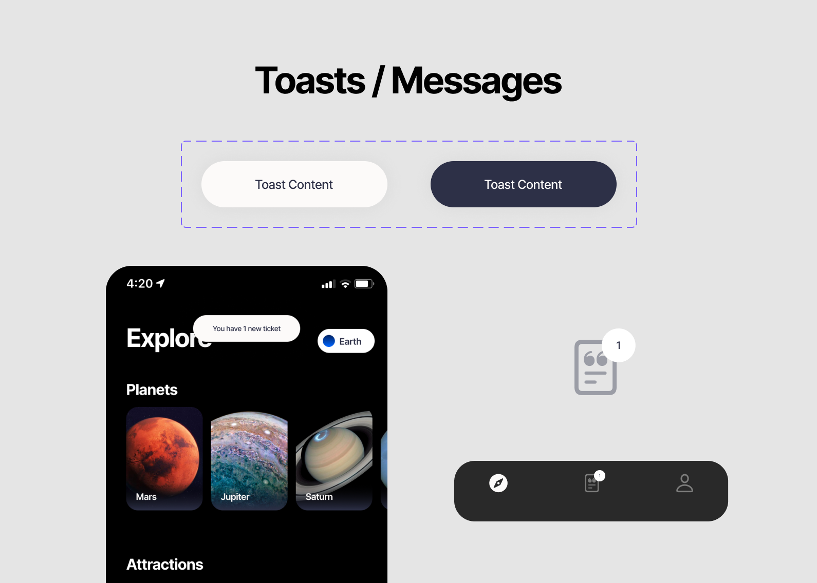
Components
The list of components to build: CTA buttons, Menus, Nav and Tab Bars, Dialog Boxes, Cards, Progress Bars, Radio Buttons, Message Indicators, and Lists.
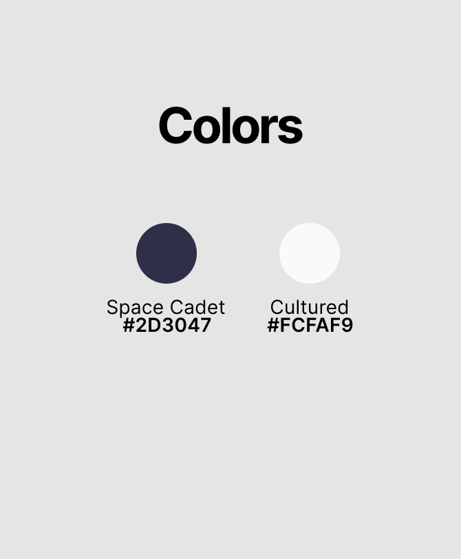
The theme for the library is space, and the colors are Space Cadet(#2D3047) and Cultured(#FCFAF9). The Contrast ratio for the colors is 12:41 : 1, and this combination provides good legibility, even for colorblind users.
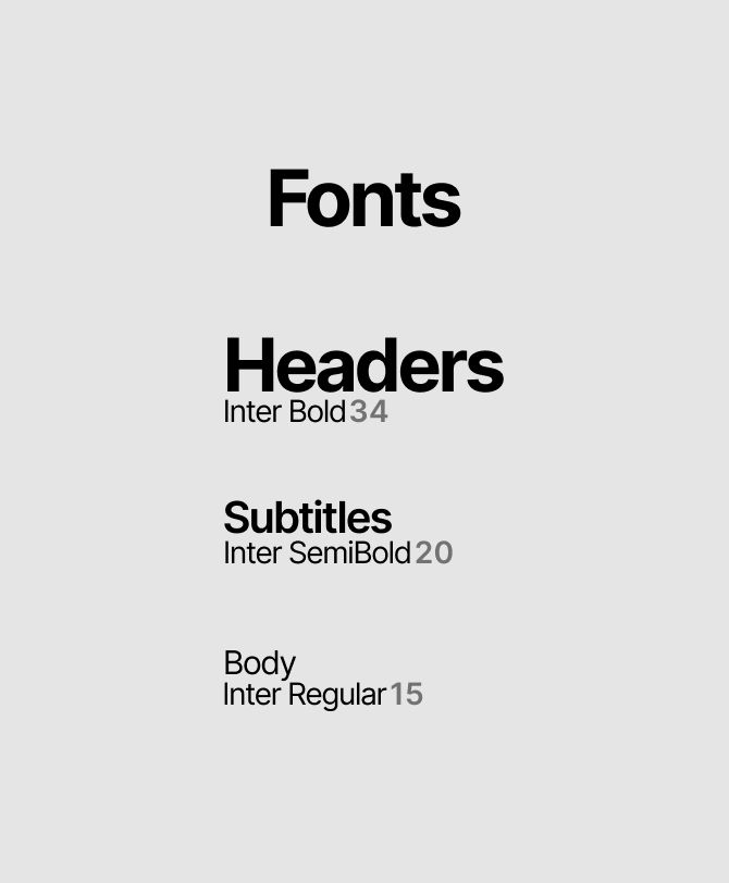
The Chosen Font is Inter, inspired by the New York and Washington DC transit branding. Inter is a clean and bold typeface with good legibility. These components are custom designed, and inspired by Apple's native system components, with some extra features.
Which end up being a beautiful set of screens