Rebranding The Met
This is completely and only a visual design project. This does not contain any UX work or research.
Prompt
You will be creating a new Visual Design Language for The Metropolitan Museum of Art. You will need to do a heuristic audit - essentially a personal preference audit and how the visual design should be improved.
Heuristic Eval
I did a complete evaluation of the website and the visual language of The Met, and made notes of what I thought could be improved from my side.
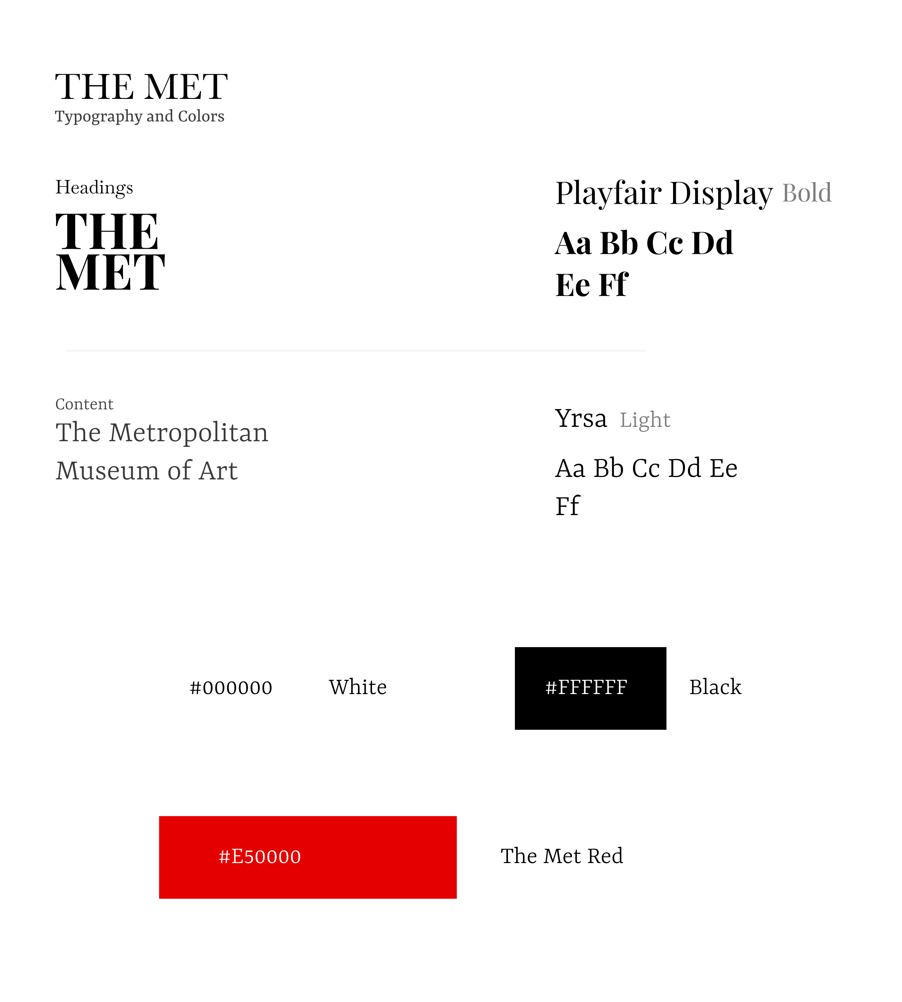
Branding
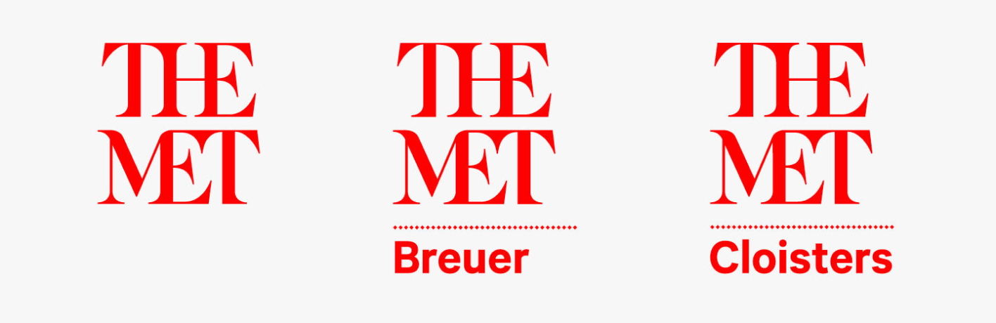
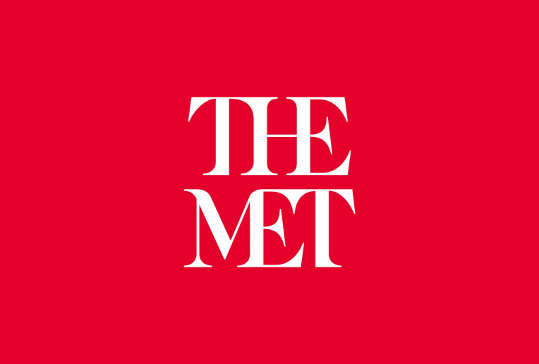
The Met did a rebranding overhaul in 2016, wherein they switched from the Metropolitan Museum of Art to simply, The Met. It’s definitely a bold move and they got a new color and logo to go with it.
The new logo is an original drawing inspired by the strategic intent to draw 'connections' throughout the Museum, across time and culture, and between people and art. It is fluid, lyrical, and distinctive, like an authentic signature.
The logo faced massive criticism from designers around the world, and was also called “A typographic bus crash”. I weirdly agree. The mashing of letters together doesn’t show the elegance and feel a museum should bring.
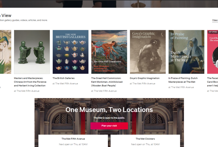
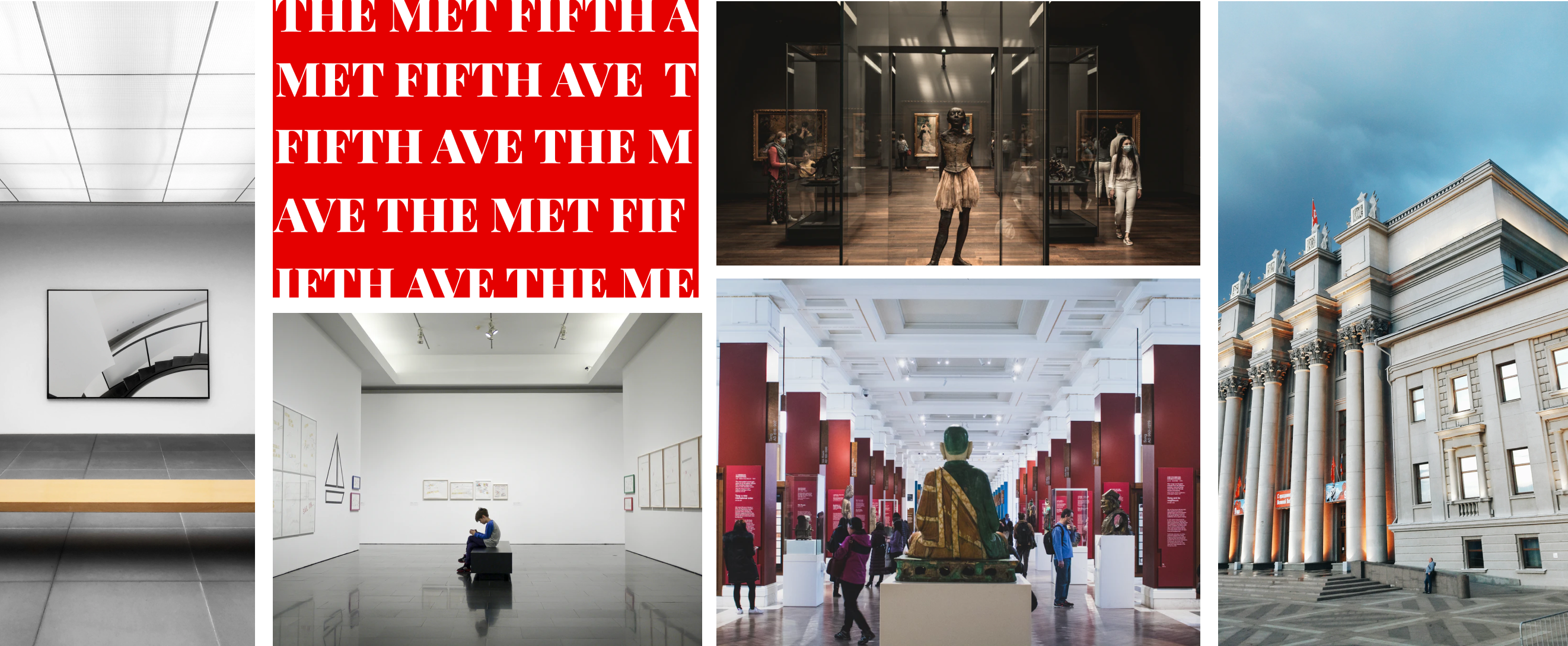
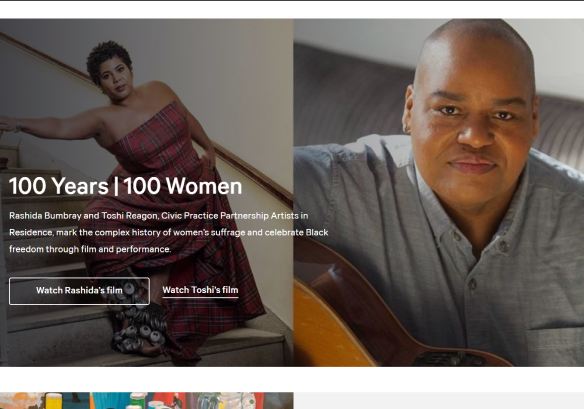 Extremely lenient usage of screen real estate.
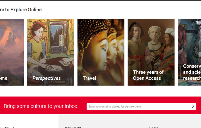 Extremely high amounts of information.
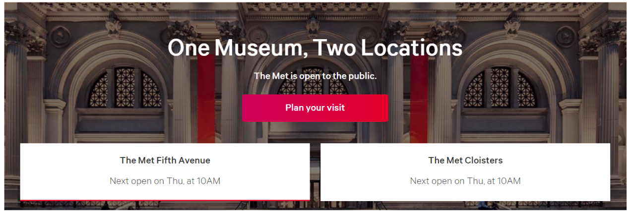 Fun fact: The red button is actually not a button.
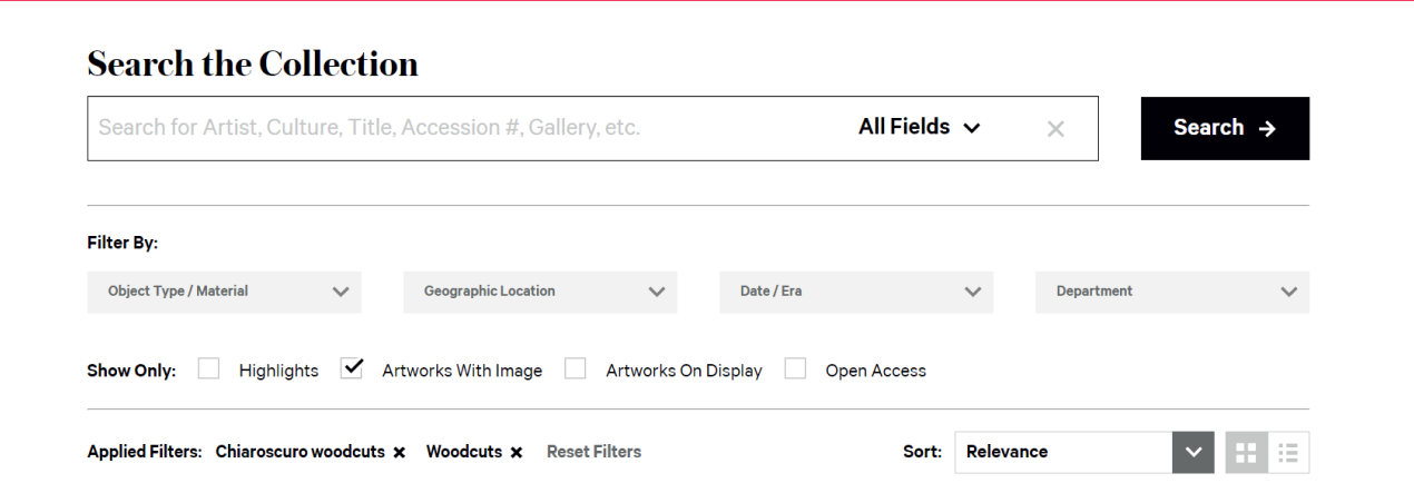 Very E-commerce-istic view when browsing art.
Brand Strategy
Based on my evaluation, I decided on a new focus and strategy for The Met's design
1. Return the branding back to a classier, artsy style.
With the closure of the Met Breuer, the comtemporary and modern art museum of The Met, I believe that the logo doesn’t suit the whole new modern look anymore.
2. Revitalize the website as an informative website.
Right now, the website seems overly cluttered with information, visiting, exhibits and patronage. I feel that a reduction of information is necessary.
Moodboard
Calm. Stoic. Clean. Elite. Timeless.
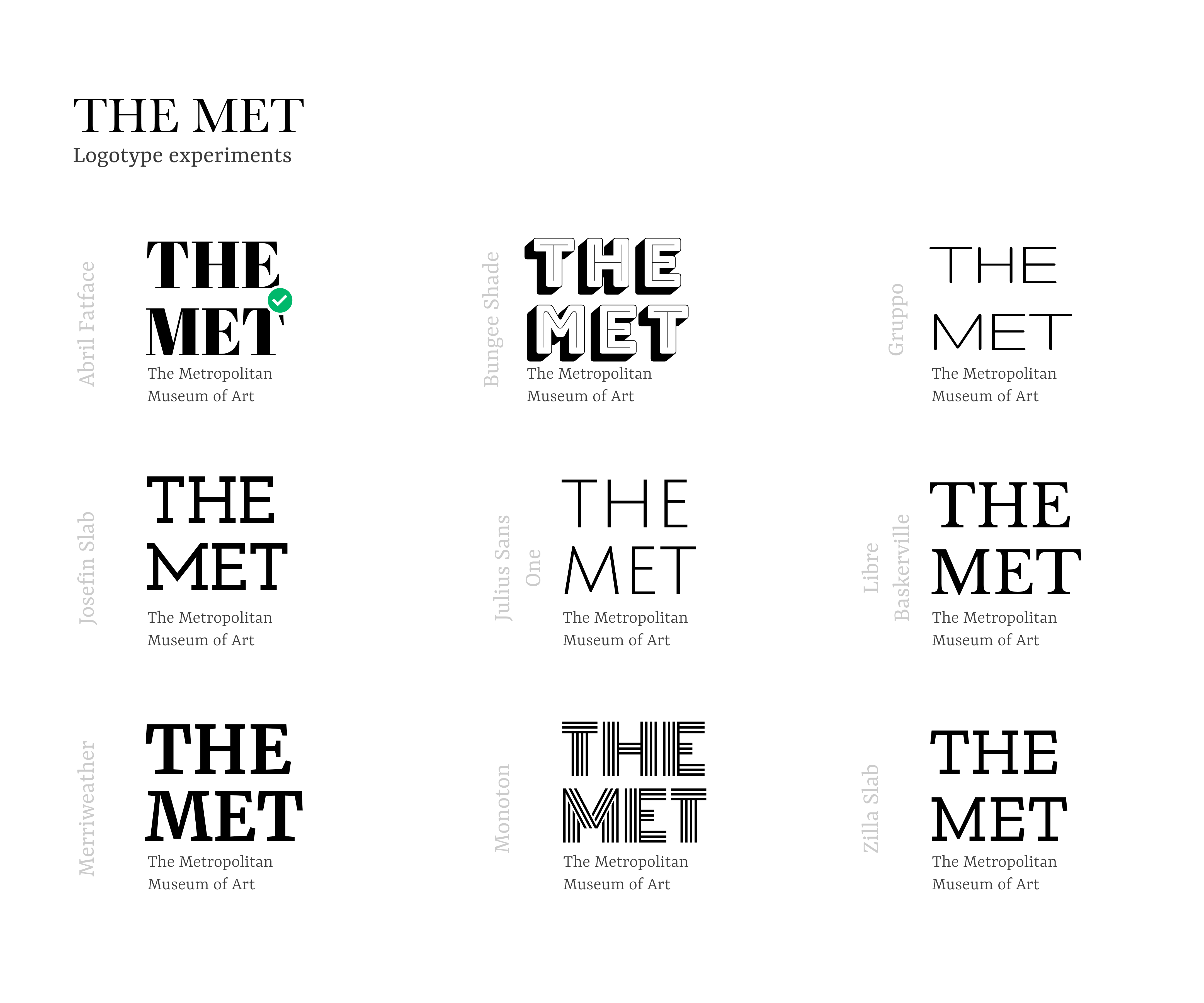
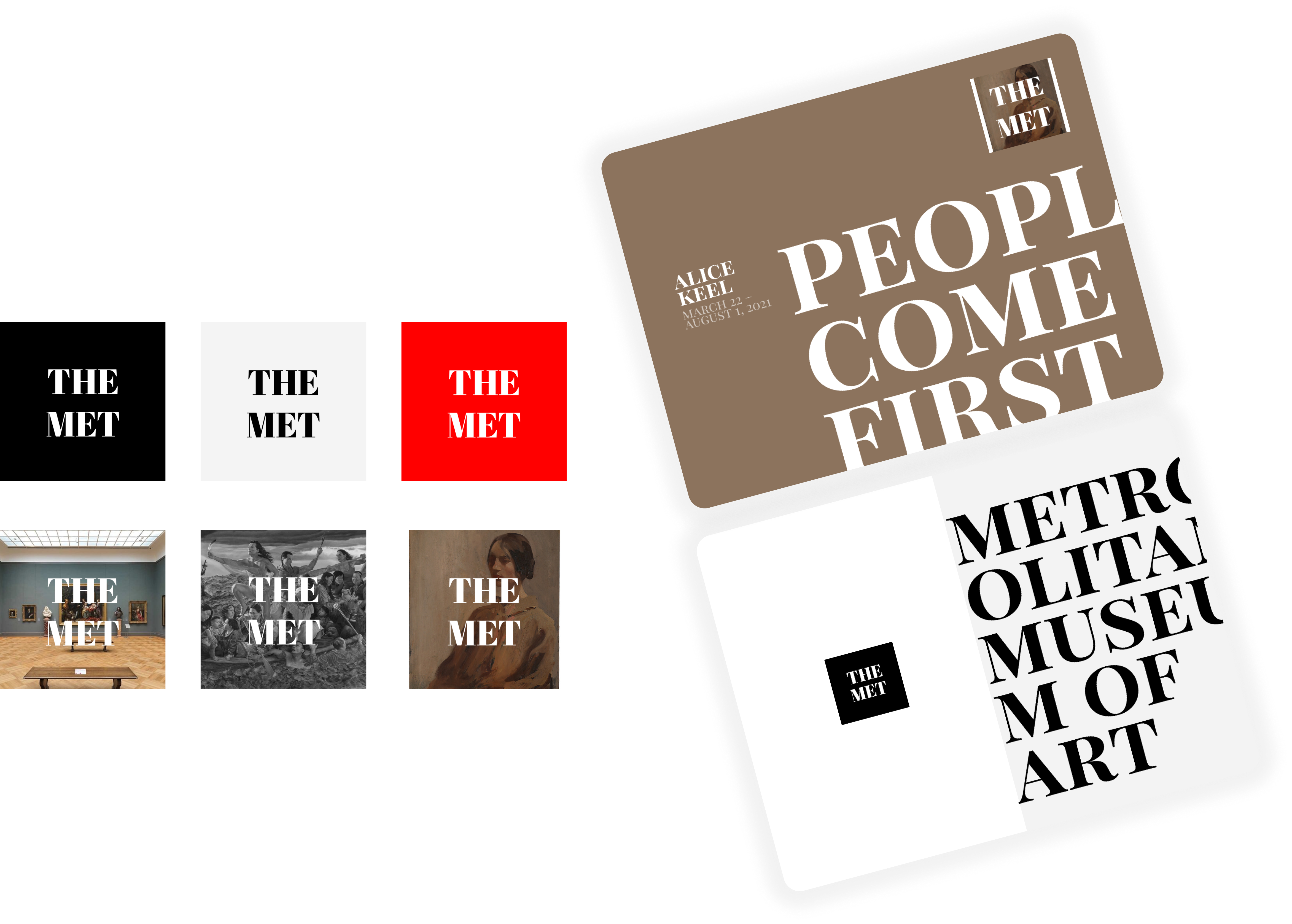
Branding Experiments
Once I had an idea for the Logotype, and had my Type and color sorted out, I experimented with pictures and text to get a better look and feel for the new design language
Iteration 1
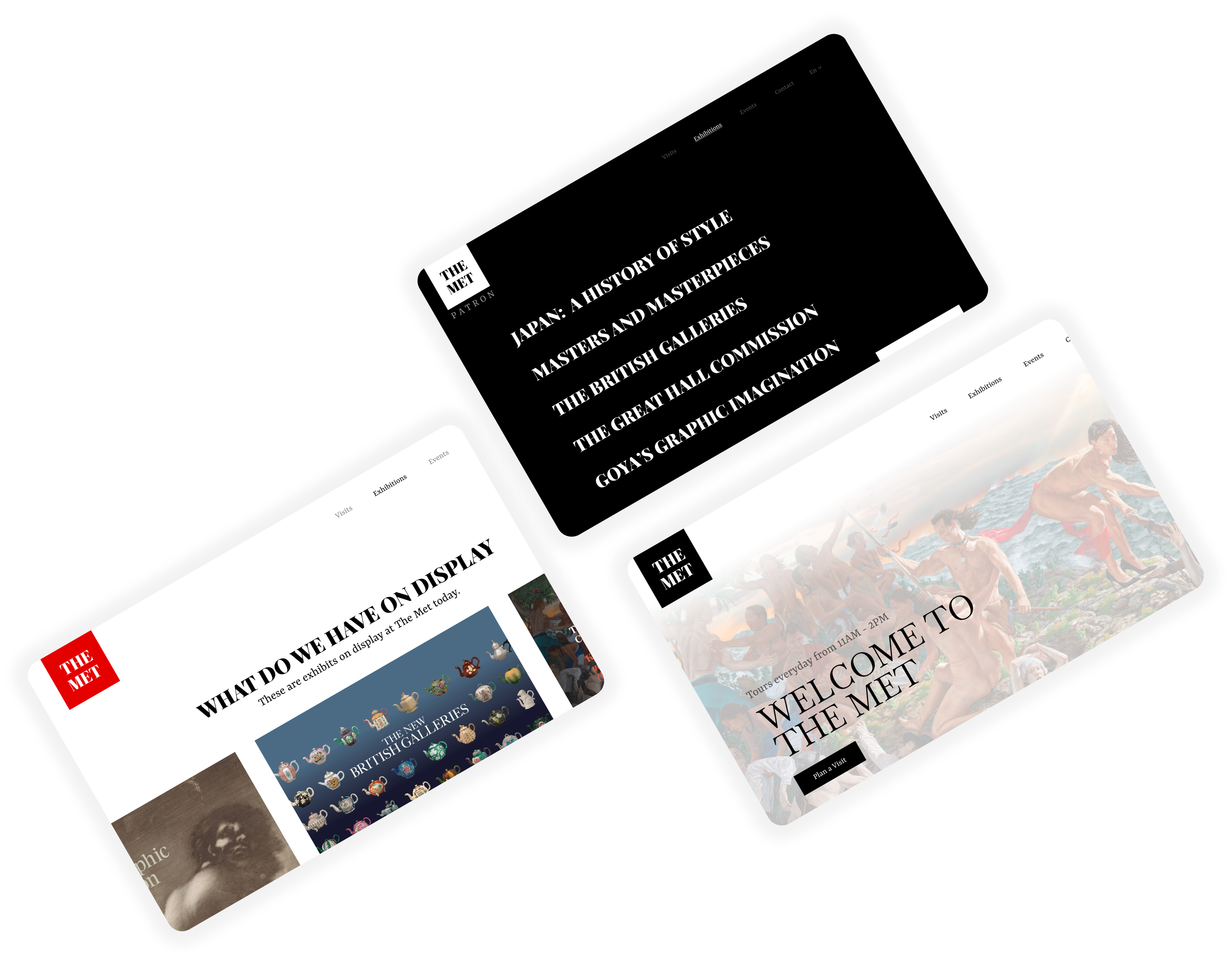
For the first iteration, I cleaned out the current website, and remodeled, with newer, shiny visuals. I sketched my ideas in my notebook, and fleshed out some high-fidelity screens on Figma.
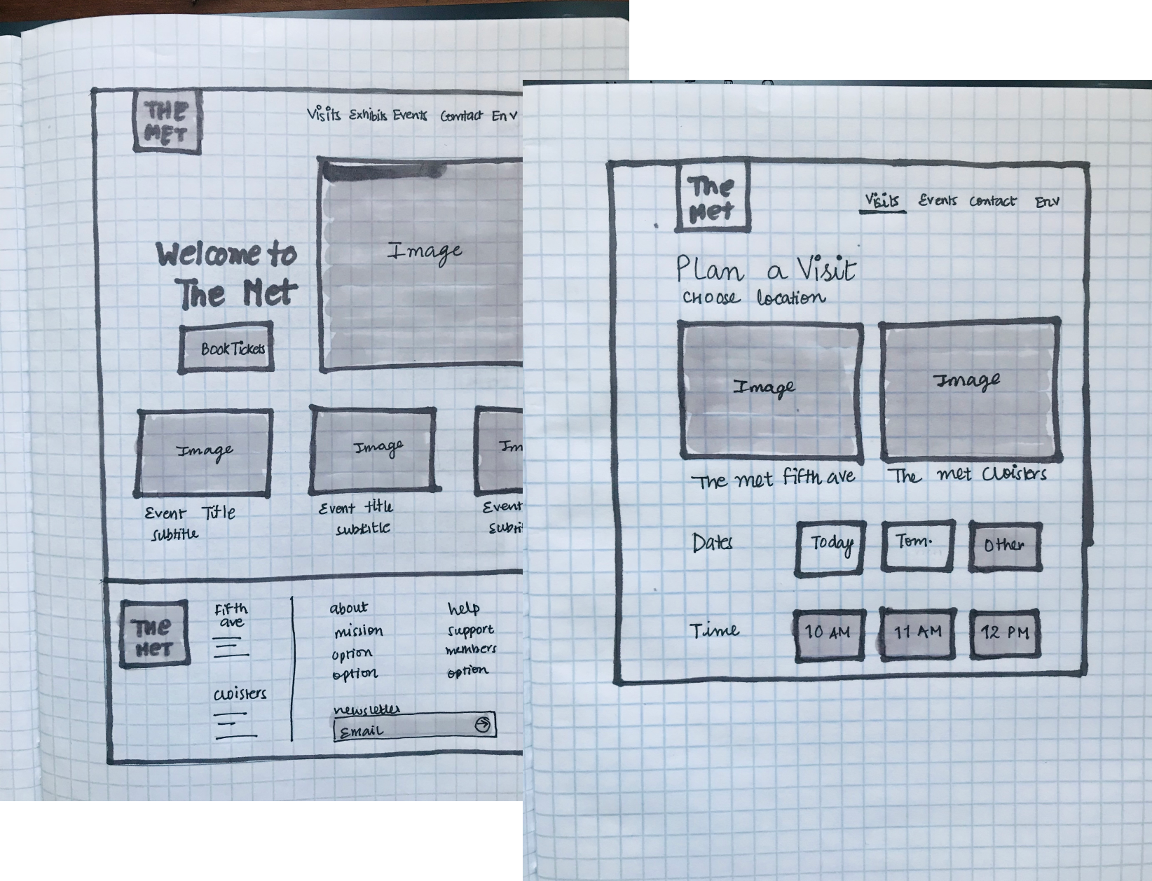
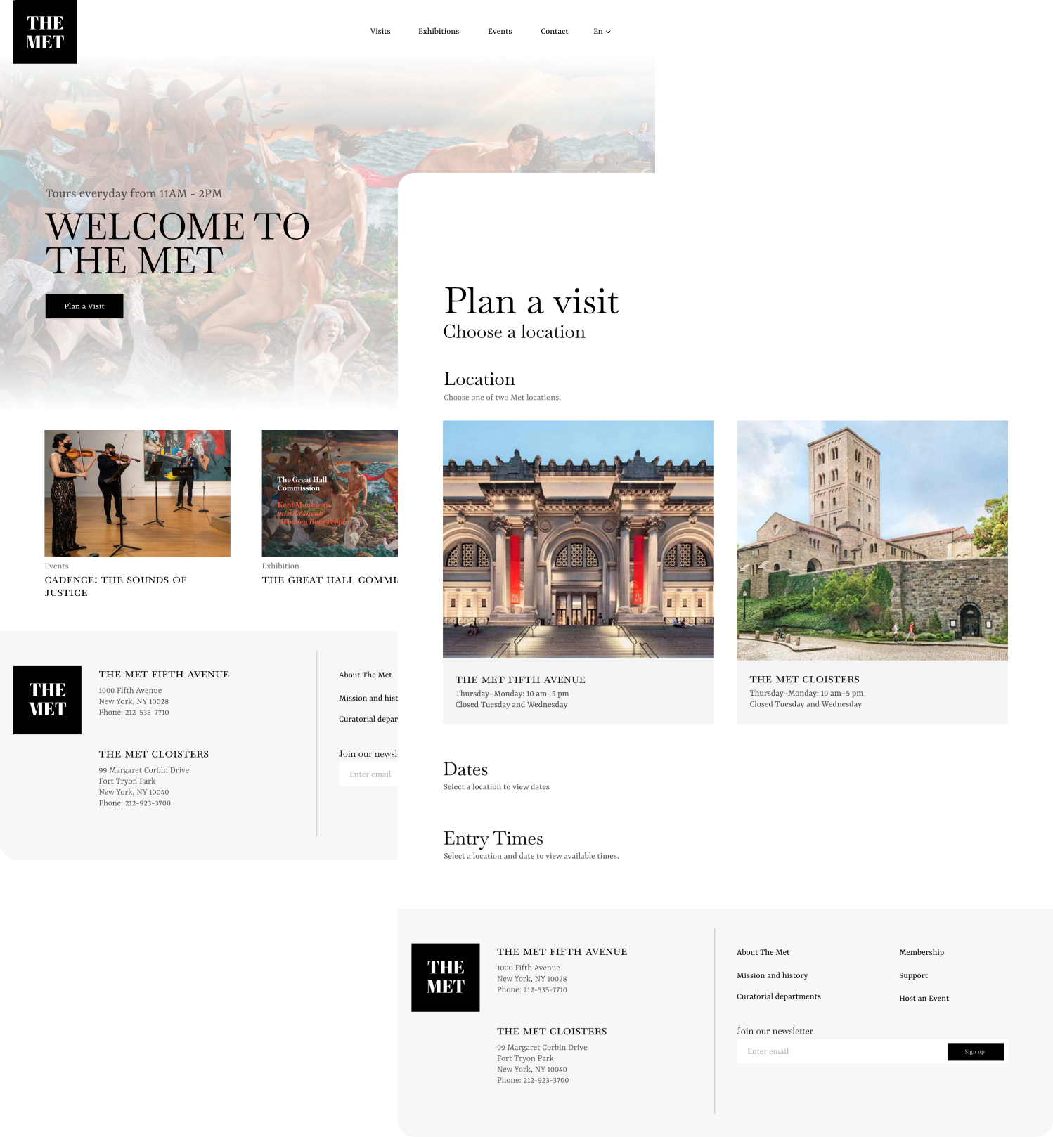
Iteration 2
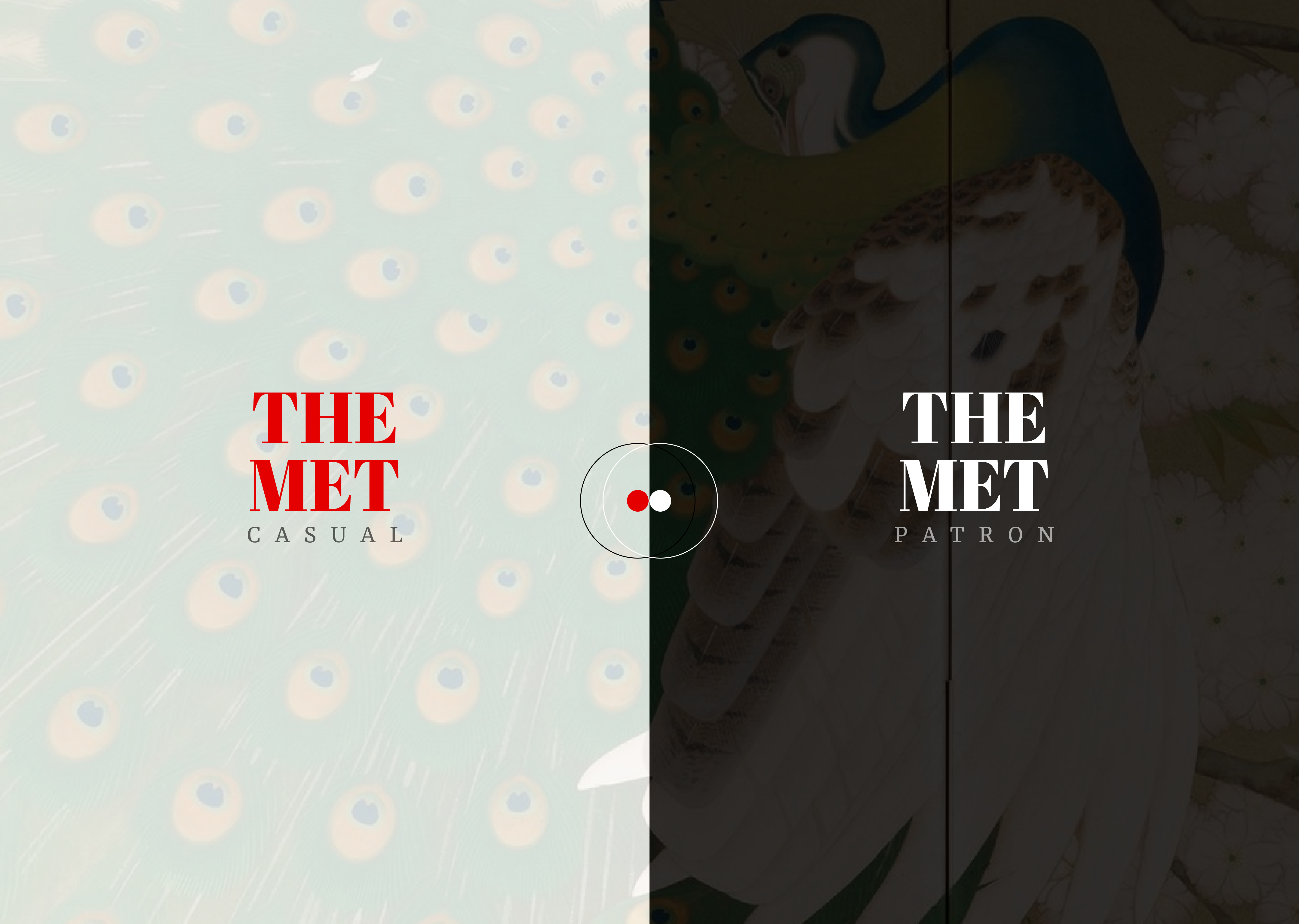
Although this was a much cleaner version of the current website, I felt there would be a great deal of information loss. I had to figure out a way to keep both the details for the people who wanted it, while simulatenously keep it clean for those who don't. At this point, I decided to divide the whole experience into two: The Met - Casual and The Met - Patron.
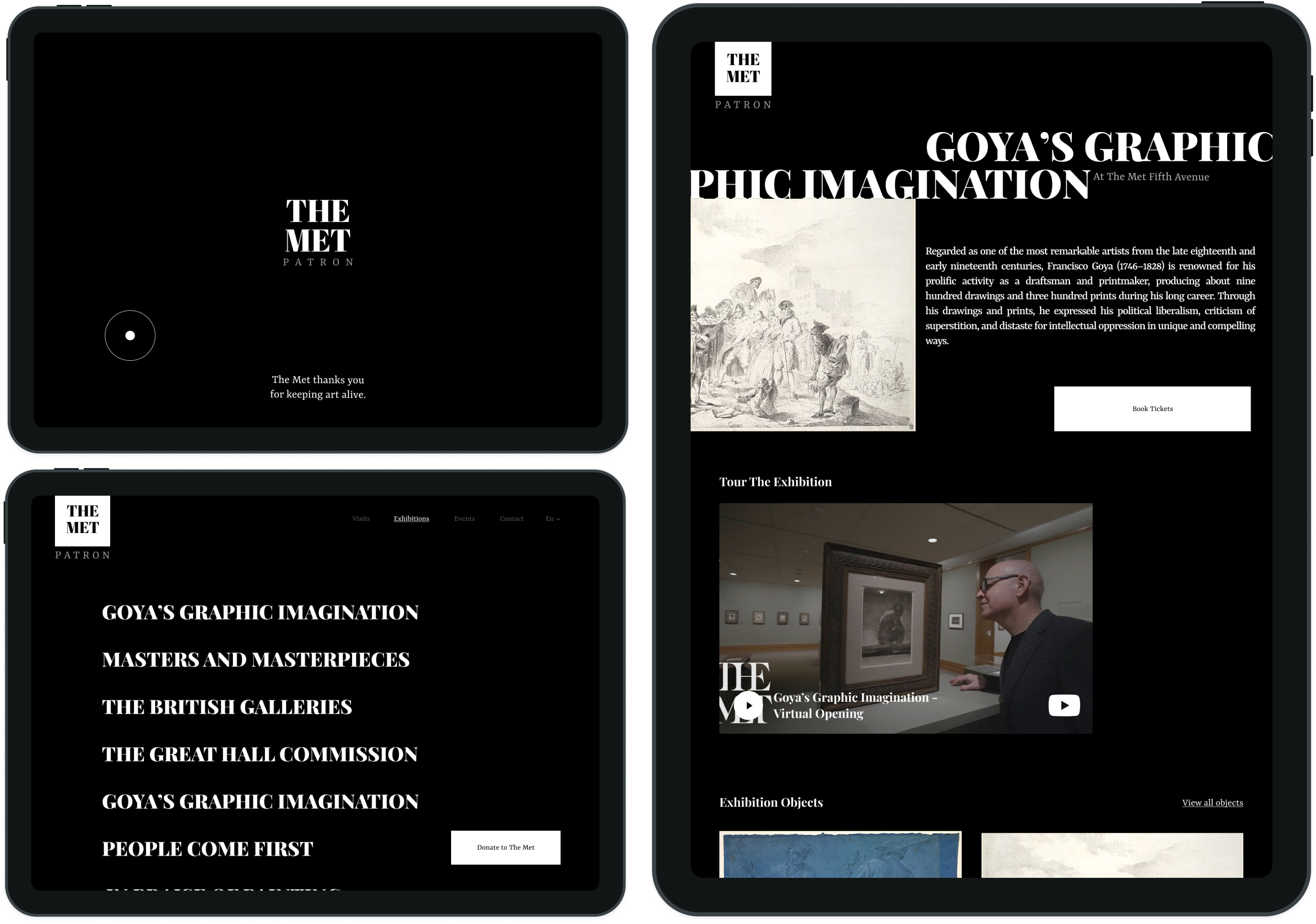
Experiences
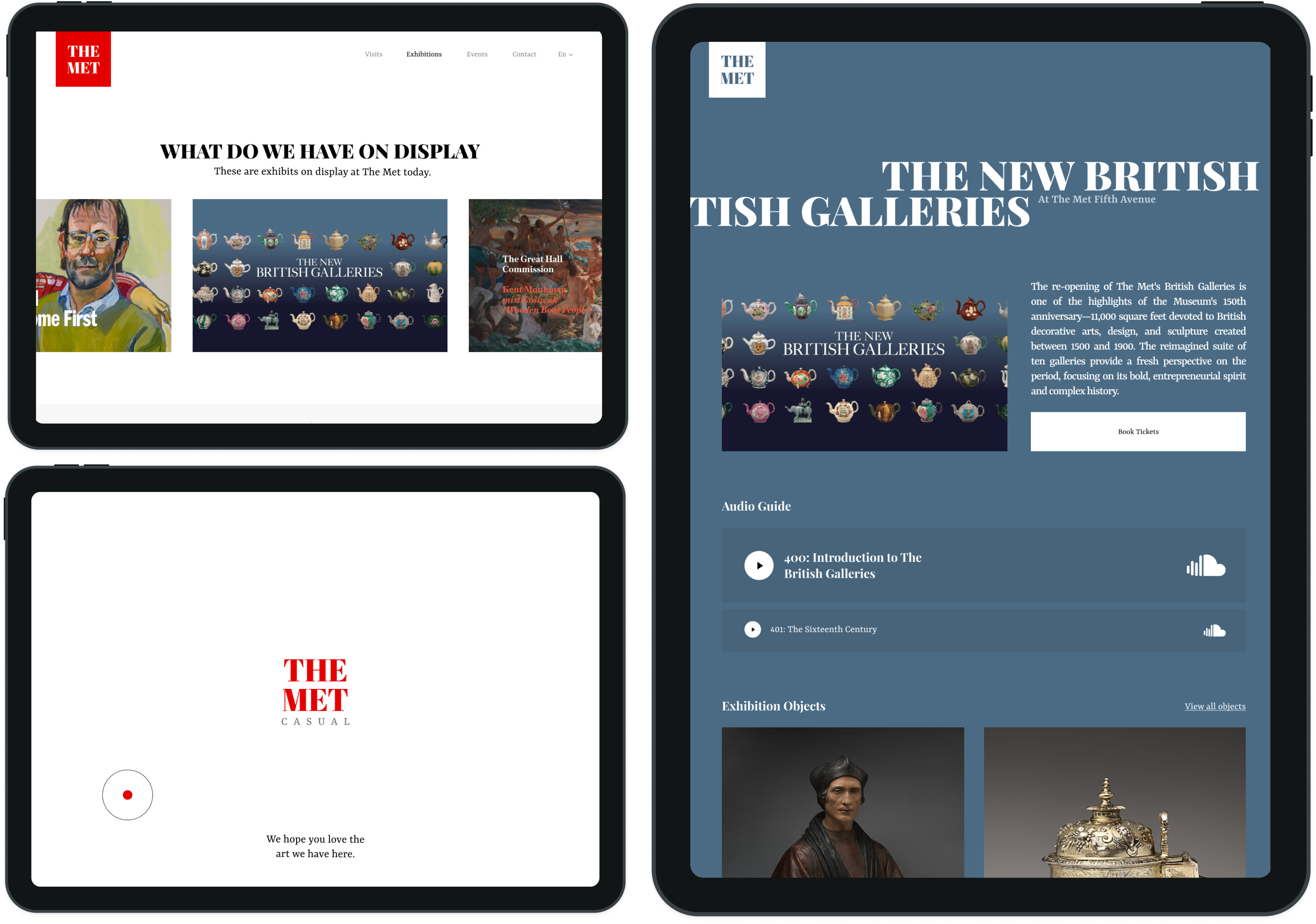
The Met: Casual is designed to be more informative in nature; It's meant for art amateurs and enthusiasts, who like visiting museums once in a while, and enjoy art lightly. Casual contains information about the art, the artists and audio/video guides in detail. Casual is open to everyone who wants it.
Elitism
The Met: Patron is designed to be an exclusive-donations only group of people who follow and admire art to the maximum. These people contribute generously to the advancement of art all over the world, and keeps it thriving. They get exclusive pre-screenings and private shows for the latest art at The Met. It makes sense that their website and virtual experience be just as elite.
Non Digital Executions
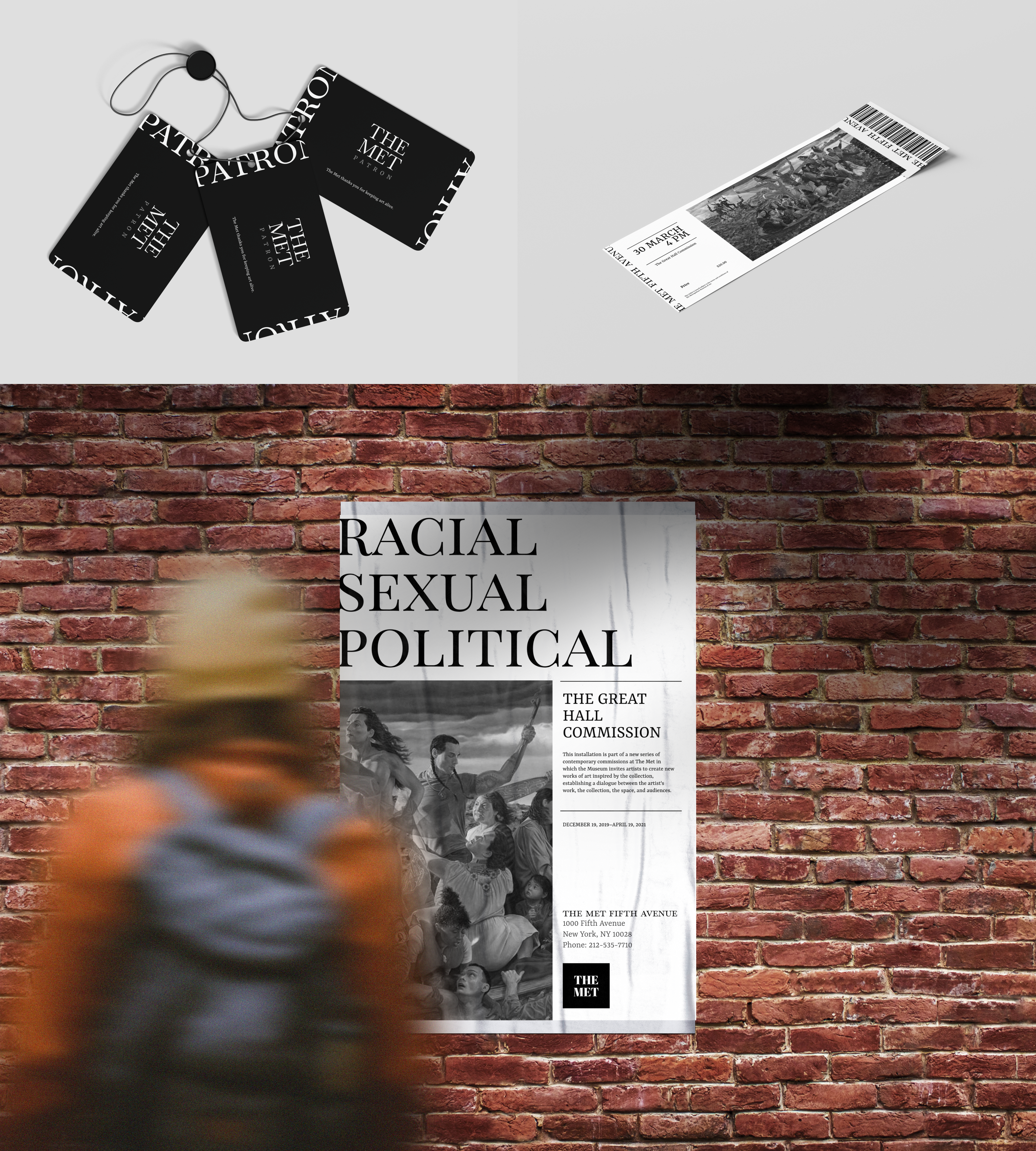
As a deliverable, we had to design a couple of non digital experiences for The Met's new visual design language.
Key Takeaways
Rebuilding a Brand Strategy based on an heuristic audit,
Reprioritizing Pages and Menus,
Reintrigrating all important parts of the website, while still keeping it clean and minimal.